Overview
Modernizing a Legacy Page Used by Millions
PDL's Product Detail Page (PDP) is a legacy design from earlier times when the company was just Peapod. A lot has changed since then. Peapod is now Peapod Digital Labs, and the platform has expanded to serve as the omnichannel solution for major grocery brands across the East Coast. Though other areas of the site evolved, the PDP was left behind. We took this opportunity to conduct a ton of research and update this page to give users exactly what they are looking for.
The goals:
- Update design and content hierarchy
- Prioritize the most important information to customers — surface relevant info as soon as possible, update product feeds, provide avenues for inspiration
- Follow e-commerce best practices
- Improve personalization
Who Really Needs This?
Customers
Our customers have changing needs. Surfacing important content and providing better recommendations can help improve the shopping experience for both in-store and online customers.
Brands
Though the PDP has lower engagement, we can help make it more useful for brands by surfacing better product information and relevant content to boost sales and customer satisfaction.
Product Teams
We have great personalization work being done that we can start to leverage in new areas, in addition to generally updating legacy feeds and algorithms.
Research
Research. Lots of Research.
Working together with our UX Research team, we gathered information from every source we could find: a full site audit evaluating usability, competitive analysis, a series of surveys, and a live intercept on the current PDP to check our research in-context.
UX Usability Audit
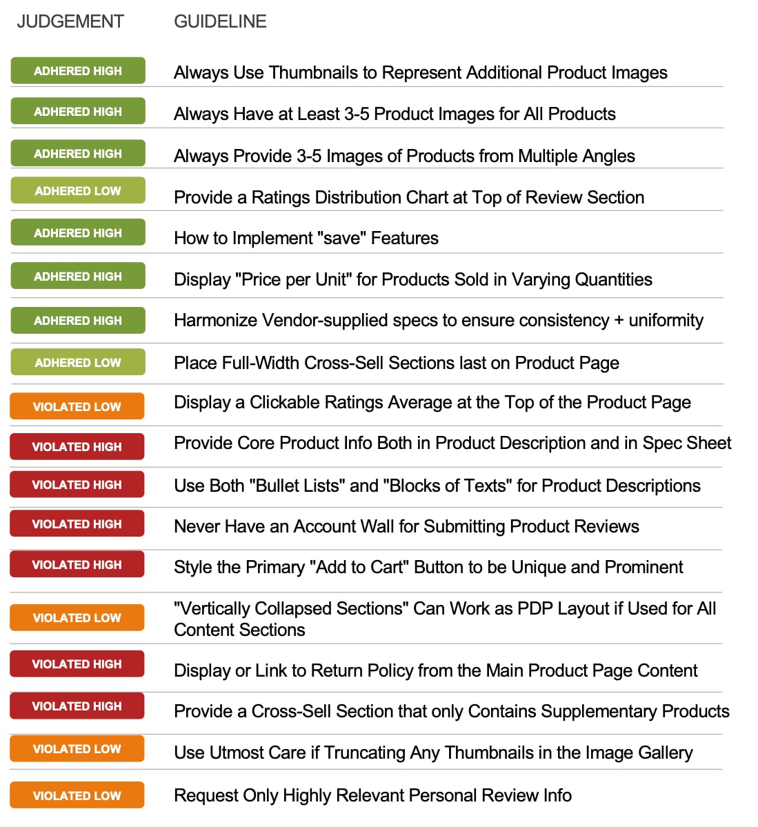
The UXR team conducted a detailed analysis of the existing site using Baymard Institute's Usability Guidelines.
Performing Well
- Product images
- Product ratings
- Price per unit
- Content uniformity
- Cross-sell placement
Needs Improvement
- Product information depth
- Content hierarchy & styling
- Supplementary product feeds
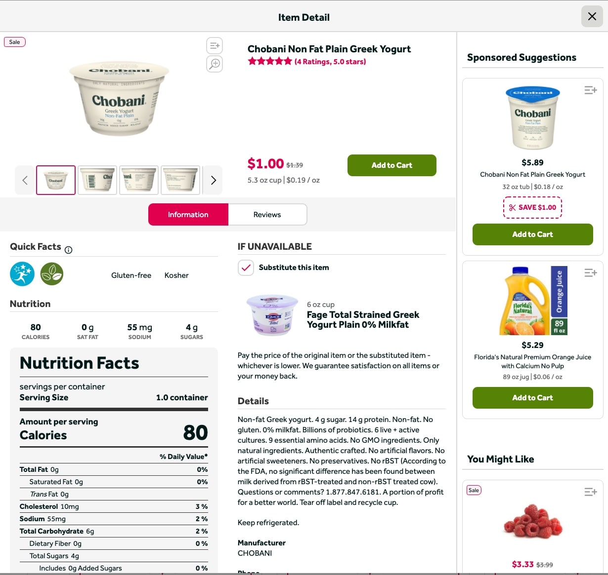
- Account wall blocking reviews
- No return policy link
A Closer Look
A few key areas for improvement stood out:
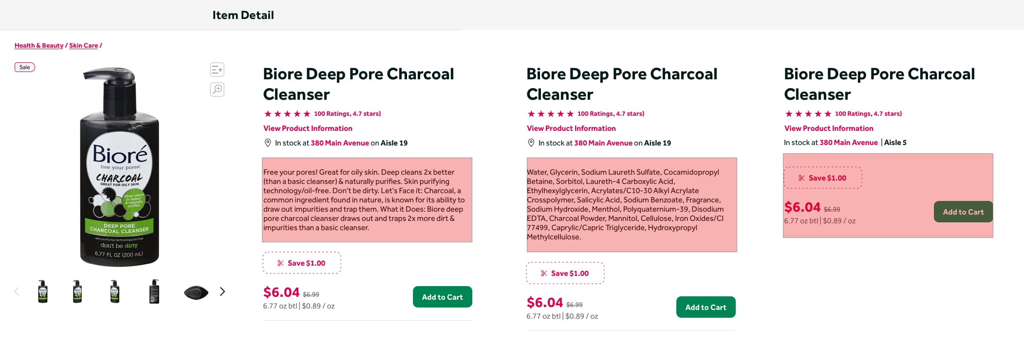
- Similar button styles competing against each other
- Overuse of tabs and sidebars
- Account wall blocking product reviews
- Big blocks of text with no bullets or numbers
- Lack of supplementary products
- No link to return policy
- Extraneous text that could be truncated by linking elsewhere
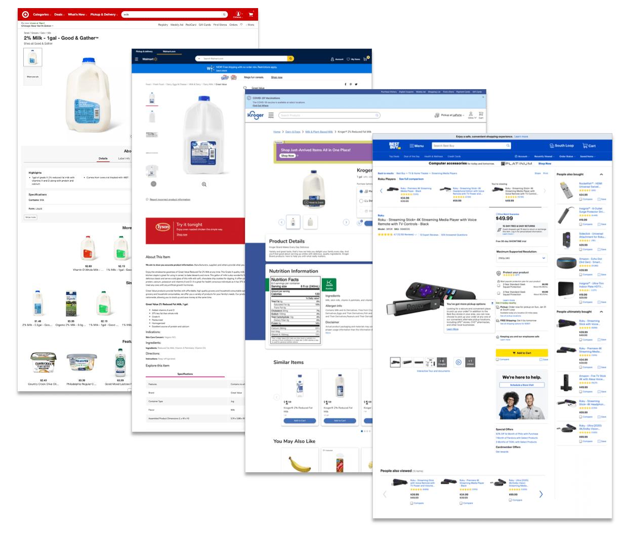
Competitor Analysis
We took a comprehensive look at what everyone else was doing for reference.
11 Grocery Competitors
- Very little consistency across competitors in terms of both content and layout
- Various use of tabs, accordions, and long-scroll pages
- In many instances, recommended products break up product info in one or more areas
- Many competitors use sliders for related products, but the kinds of products varied
6 Non-Grocery Competitors
- A majority used a long-scroll approach
- Most had a lot of additional content — marketing and inspirational content, additional product details
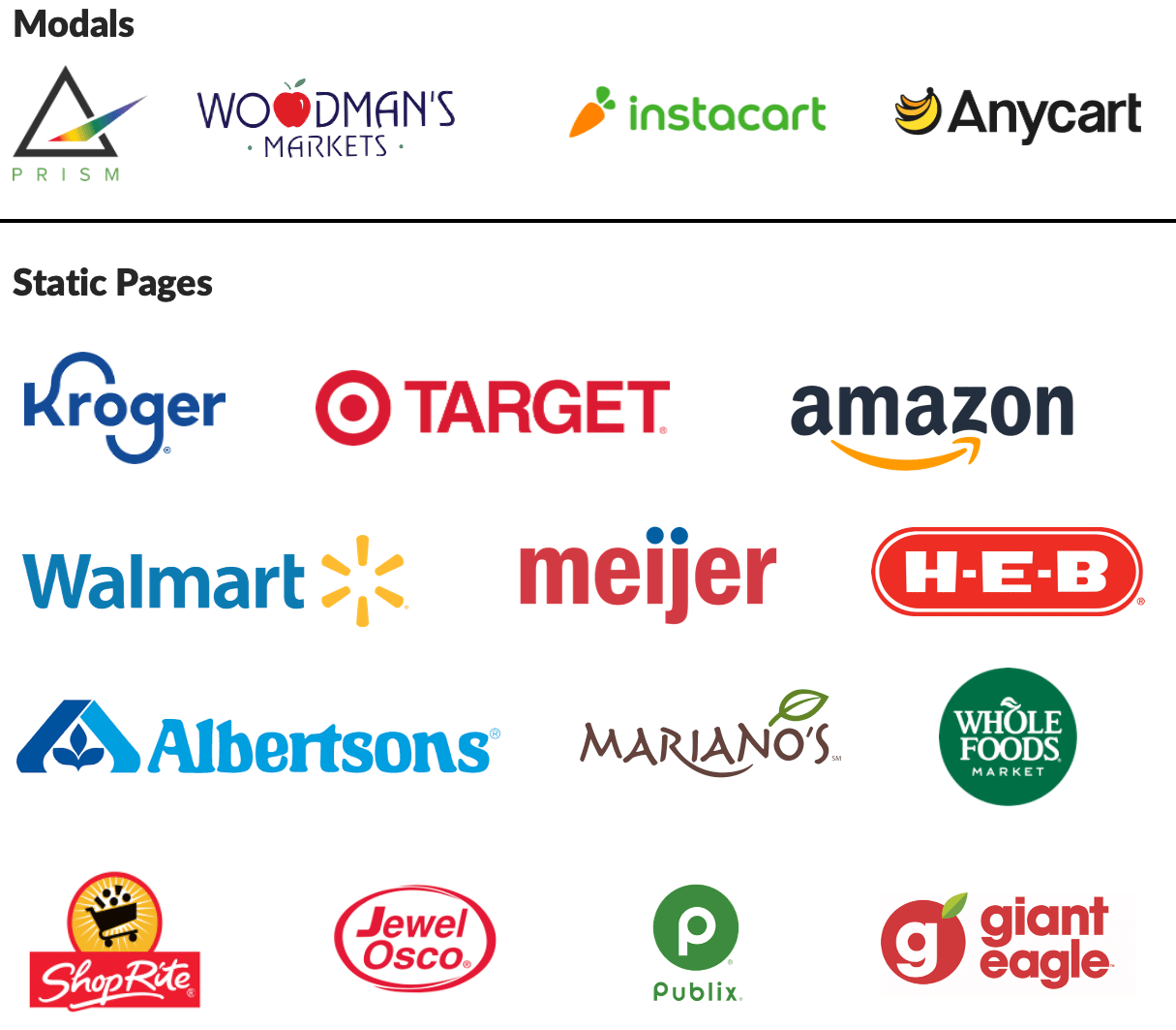
Modals vs. Pages?
The question of pages vs. modals had been floating around PDL for a while, so we set a benchmark on this too.
With this in mind, we decided to explore both options. We also focused on making improvements to the existing modal experience — adding product names and IDs to URLs, and fixing broken modal flows for a more intuitive experience.
What Users Actually Want
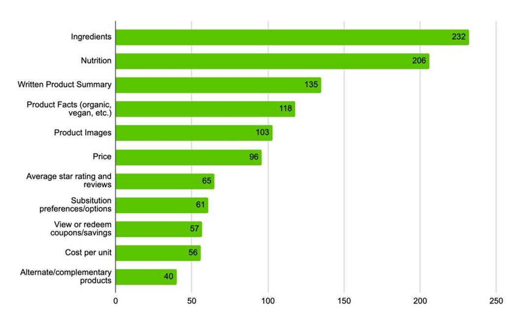
We conducted a series of studies on UserZoom to see what users are looking for on the PDP. We ran the survey 4 times — after the first round, we found that most users interchanged "ingredients" and "nutrition facts," so subsequent surveys focused more specifically on nutrition to identify the most important items.
Top nutrition priorities — rated as important as or higher than price:
Most users said they looked at the PDP for nutrition or ingredients every time or almost every time they shopped online. Results were largely consistent across all four survey rounds.
PDP Live Intercept
All previous research was out of context and did not use our real customers. So we ran an intercept survey on the live PDP to check our work in-context. Fortunately, the results matched our initial surveys. We also gathered insight into why customers use the PDP:
"Food allergies in our family so I often need to review the ingredients lists."
"New to me and considering it."
"To compare calories, sodium, and price with other similar items."
Wireframes
So. Many. Ideas.
I used the most important research takeaways as a foundation for wireframing, focusing on high-level content prioritization and new features in a mobile-first approach. The one thing I knew I needed to do was surface the most important product information as early on the page and as close to the "Add to Cart" CTA as possible. Ideally, users would see this information and get everything they needed without scrolling further. A few of these early wireframe ideas became the foundation for the biggest changes in the redesign.
Design
Two Approaches. One Winner.
For the actual designs, I created two distinct approaches. The first was a safer, long-scroll approach that focused on updating existing content and features based on research and best practices. I was later asked to "get far out" with it, so I created a second approach that introduced new content modules and features — ambitious, but worth exploring.
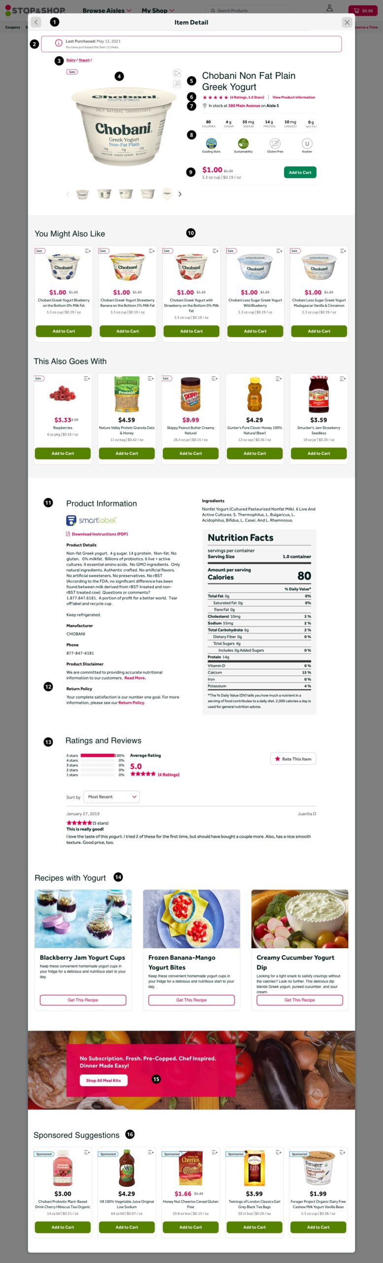
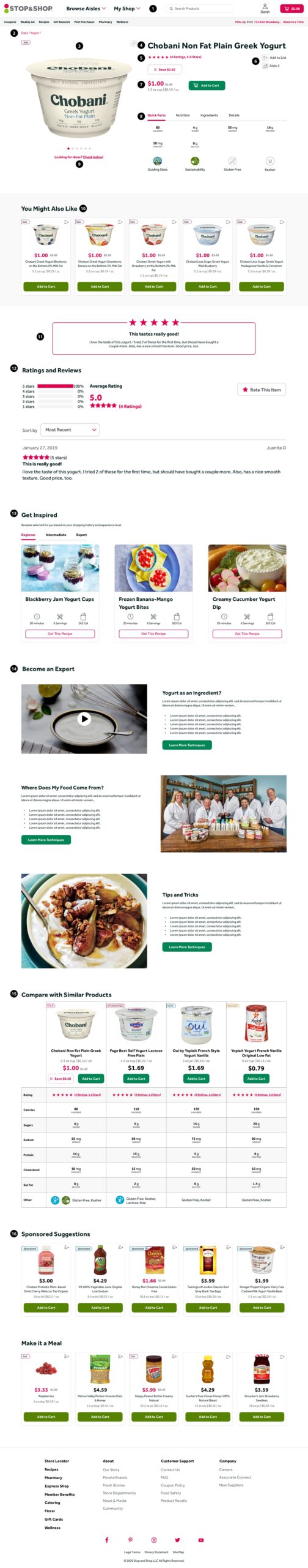
Approach 1: Safer Long-Scroll
This approach optimized the existing modal experience using research and best practices, without requiring a major platform rebuild. It was designed to ship quickly and deliver immediate improvements while laying the groundwork for future iterations.
Key design decisions in Approach 1:
- Modal — Kept the modal but fixed existing flow problems and applied specific URLs to each so users could link directly to product pages. Linked URLs display as a static page, not a modal.
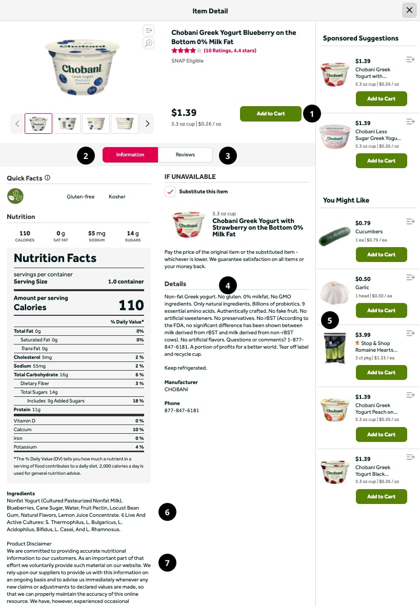
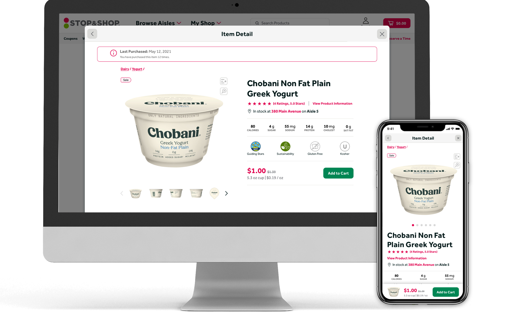
- Last Purchased Banner — Surfaced at the top of the page to prevent clutter in the Product Hero Area. Uses past purchase history to remind the user when they last bought this product. Planned for A/B testing to measure conversion impact.
- Breadcrumbs — Helps keep users oriented in their browsing process and offers a quick back-navigation if the product isn't working for them. Also great for SEO.
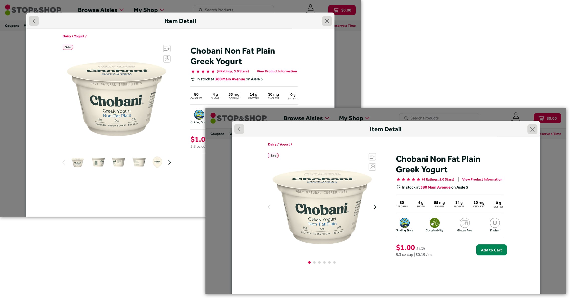
- Image Slider — Larger images and improved interactions.
- Product Name — Clear and prominent, following standard hierarchy.
- Quick Links — Clear labels for Star Ratings and Product Details, following Baymard best practices. These anchor-link to content further down the page.
- Product Stock Information — Tells the user if the product is in stock at the selected store and where they can find it. Expanded further in Approach 2.
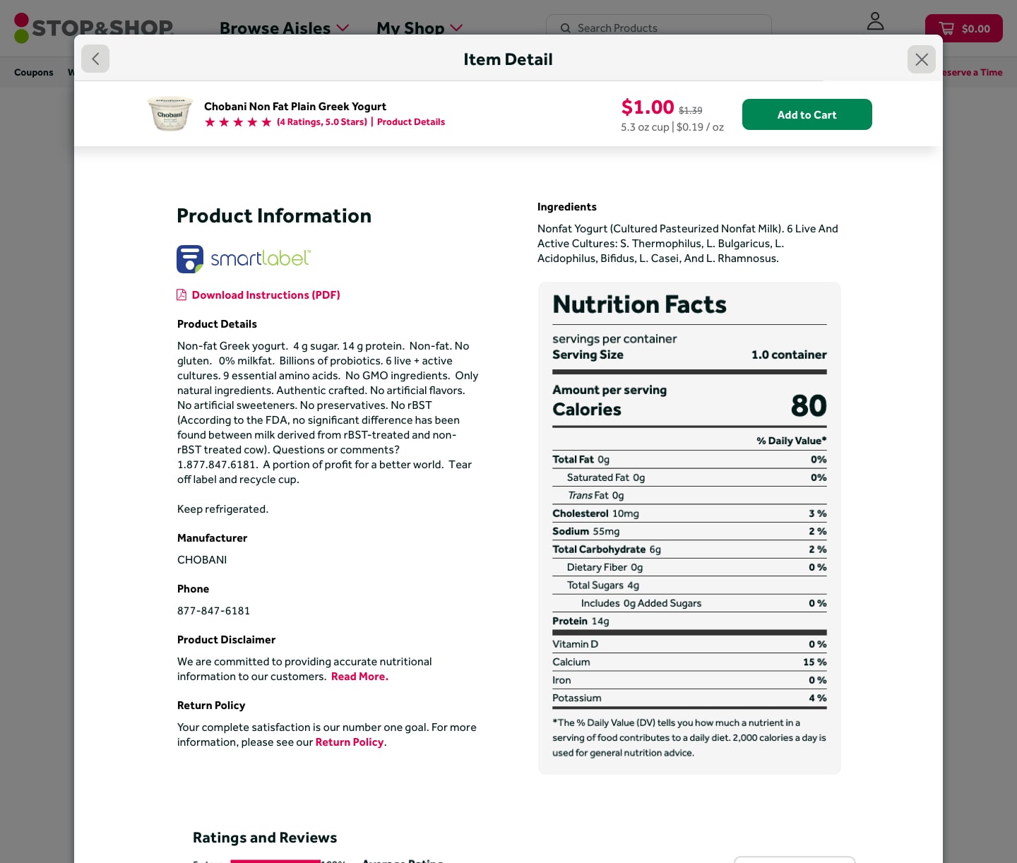
- Product Quick Facts — The focal point of the Hero Area. Arranges the top 6 nutrition facts and additional product callouts with an icon/label treatment. The goal: get users all the information they need upfront, without scrolling.
- Add to Cart — One guideline we did not change due to branding restrictions (Baymard recommends a distinct treatment for "Add to Cart" CTAs). The removal of the sidebar and competing CTAs should help address the issue regardless.
- Updated Product Feeds — No more onions as a complimentary product for blueberry yogurt. "You Might Also Like" features alternate flavors and sizes. "This Also Goes With" follows Baymard guidelines by offering supplemental products to help users build a complete meal.
- Updated Product Information — Complete content hierarchy overhaul. While the volume of product content prevented reducing bulk, typography improvements make it significantly more legible.
- Disclaimers and Policies — Cut down from large text blocks with "View More" accordion to short, focused links to dedicated pages rather than repeating all content on every product.
- Ratings and Reviews — Third-party plugin largely unchanged, but quick links at the top make this section much easier to find and navigate to.
- Inspirational Content — Personalization features pull in recipes based on past purchases. Future: skill-level recommendations based on purchase history (more complex recipes for users who buy niche ingredients).
- End of Page CTA — Highlights other offers or similar products prominently. Research showed many users are looking for meal planning help, so one strong use case is showing users full meal kits.
- Sponsored Suggestions — A revenue-driver we can't remove, but by placing it at the bottom of the page, we let the rest of the page breathe and use this as a final route for the user to continue their shopping journey.
Approach 2: Tabbed Inspirational
A more ambitious direction that followed all the key research takeaways above the fold, then introduced entirely new content modules as users scrolled — meal planning features, a product comparison chart, a store map, expanded recipe cards, and brand/SEO content blocks. Many of these features may not make the initial cut but can be phased in over time.
Key design decisions in Approach 2:
- Static Page — Though the updated modal solved a lot of flow and SEO issues, this concept used a full static page to provide extra real estate for the more robust content blocks below the fold.
- Breadcrumbs — Same as Approach 1: helps users stay oriented and provides SEO value.
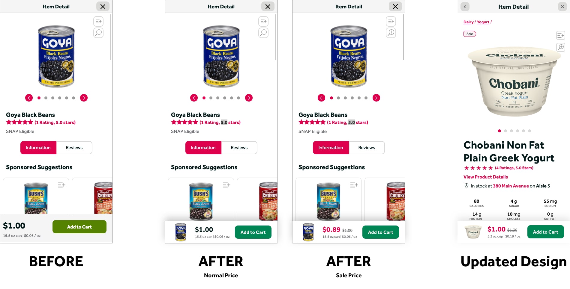
- Image Slider — Larger images with improved interactions. In this case, I went against the Baymard guideline and removed thumbnails from the main display. Many product images aren't great, and the nutrition label is often cut off or available elsewhere on the page. This also removes visual clutter in a Hero area that already has tabs and quick facts.
- Product Name — Clear and prominent.
- Star Ratings — Clearly called out below the name, linking to the ratings and reviews section further down the page.
- Secondary Information — Moved a few pieces of additional info to a side column for clarity. "Add to List" still needed improvement and was earmarked for A/B testing.
- Add to Cart — Same decision as Approach 1: branding restrictions prevented the Baymard-recommended treatment, but sidebar removal helps clean up competing CTAs.
- Tabs — The biggest change. I went against best practices here, but the decision was data-driven. If most users want quick facts, why not group everything into one area and lead with what people are actually looking for? If it works, users leave happy with less engagement on other tabs — a positive outcome.
- Additional CTAs — A text link to draw attention to inspirational content, anchor-linking down the page for users who don't scroll naturally.
- Updated Product Feeds — Similar to Approach 1 but with only one feed above the fold, since there are more avenues for discovery further down the page.
- Testimonial — A far-out idea to highlight a standout rating and make social proof more visible. In practice, user feedback suggested it read as the overall product rating, causing confusion. Would likely be removed in iteration.
- Ratings and Reviews — Third-party plugin largely unchanged, with quick-link navigation at the top.
- Updated Recipes — Significantly expanded. Personalization based on past purchases applies a complexity rating to help determine a user's skill level. Recipe cards were also updated based on brand research showing users want prep time, serving size, and calorie count when picking recipes — replacing generic written descriptions with actionable quick-facts.
- Brand and SEO Content — Educates users about products, brands, and cooking techniques while boosting SEO. Designed to be reusable but unique enough to avoid Google penalties. Brands were already working on this content, making it a near-term candidate for implementation.
- Comparison Chart — Pulls product tile data and expands it with nutritional information to create a simple, clean comparison. Could surface different price points, new products, and sponsored content to serve a variety of user needs.
- Additional Product Feeds — End-of-page feeds for sponsored suggestions and supplementary products, after users have fully engaged with the product at hand.
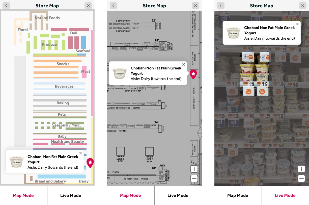
- Store Map — A new feature giving users a visual of exactly where in the store their product is located. Would require refinement of planograms to strip extraneous information. A future expansion could use this data to create an optimized shopping route for in-store customers.
And the Winner Is: Safer Long-Scroll. The general thought was to start with what we have, make major improvements to product information, visual design, and feeds — then build out and test new ideas as we go.
A/B Testing
So What's Next?
We have to start building. We have to start updating algorithms to make our product feeds better. And we need to test some of these ideas. We're close, but not totally done. Depending on how some of our A/B tests go, we will continue to make small tweaks as we gear up for production. Here are the things we plan to test.
Image In Sticky Footer
We want to add an image thumbnail to the sticky "Add to Cart" footer on mobile. The hope is this will boost "Add to Cart" conversions by bringing more prominence to the area and providing a visual reminder of the product.
"Add to List" Updates
We know our "Add to List" action is problematic. Users have expressed issues with both the placement and the icon itself. Some of these ideas are dependent on how the Image in Sticky Footer test performs. Ideas under consideration:
- Text links
- New icons
- Placement near product information
- Placement near "Add to Cart" CTA (including sticky footer on mobile)
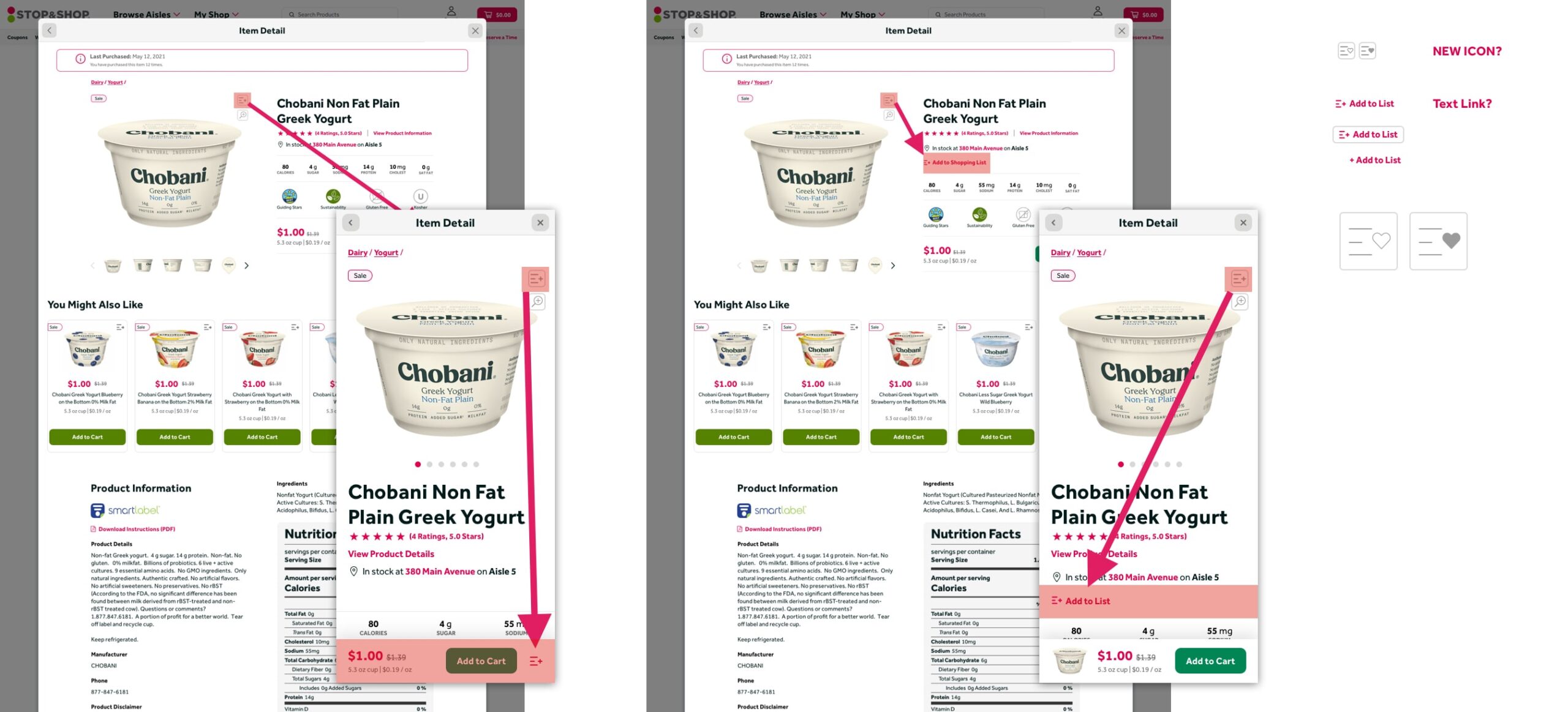
Image Slider Thumbnails
As seen in Approach 2, we want to test whether removing image thumbnails from the slider impacts engagement and conversions. The thumbnails add visual clutter in the critical Hero area where users need to quickly find product information — removing them may help.
Sticky Header on Desktop
Similar to the existing mobile treatment, but in reverse. With longer pages and more robust content, a persistent "Add to Cart" CTA at the top of the page after a certain scroll depth should increase conversions. A reminder of the image, name, price, and quick navigation links would also help users stay oriented.
Products Without Nutrition Information
Dog food. Diapers. Shampoo. Not every product has nutrition information. What do we put in that space when the product doesn't have quick facts? We want to test what gets the most engagement to make a data-driven decision. Options under consideration:
- Written description
- Product ingredients
- Nothing