Overview
Bringing the Back Office to Mobile
I joined Walgreens after hearing about Project Horizon, a concept that would take all the capabilities of the back room computer and bring them to mobile devices. Over the next six months, teams from every segment of Walgreens came together to plan out and execute this vision. Working in agile methodology to frequently iterate on ideas based on company-wide research and discovery, the design and development teams created a mobile experience to boost store efficiency, team communication, and customer service.
When this project started, Horizon was a loosely defined concept. We knew it would be a tablet (and eventually a fleet of handheld devices) that would provide services currently only available on the back office computer. Some of these would be brought into a custom app, while others would be part of different company-created apps or free consumer applications. The design would be based on Google's Material Design and Walgreens digital brand standards. How all these came together was only beginning to be seen.
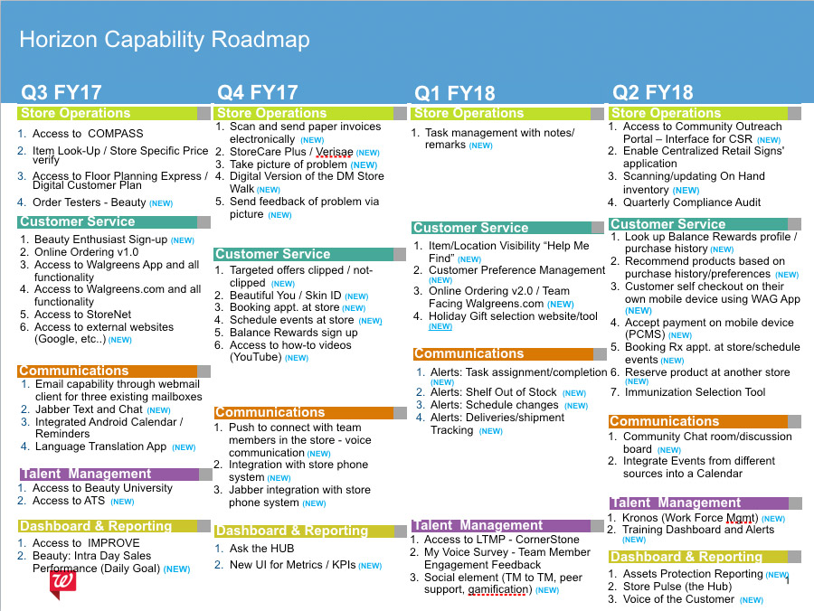
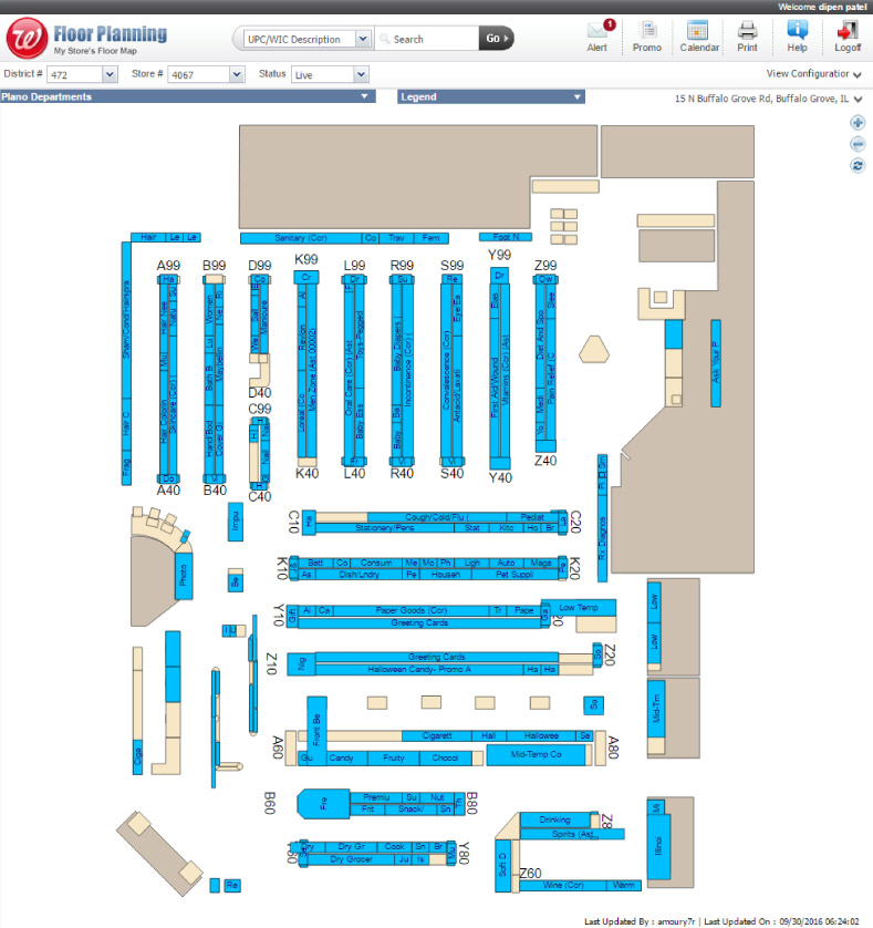
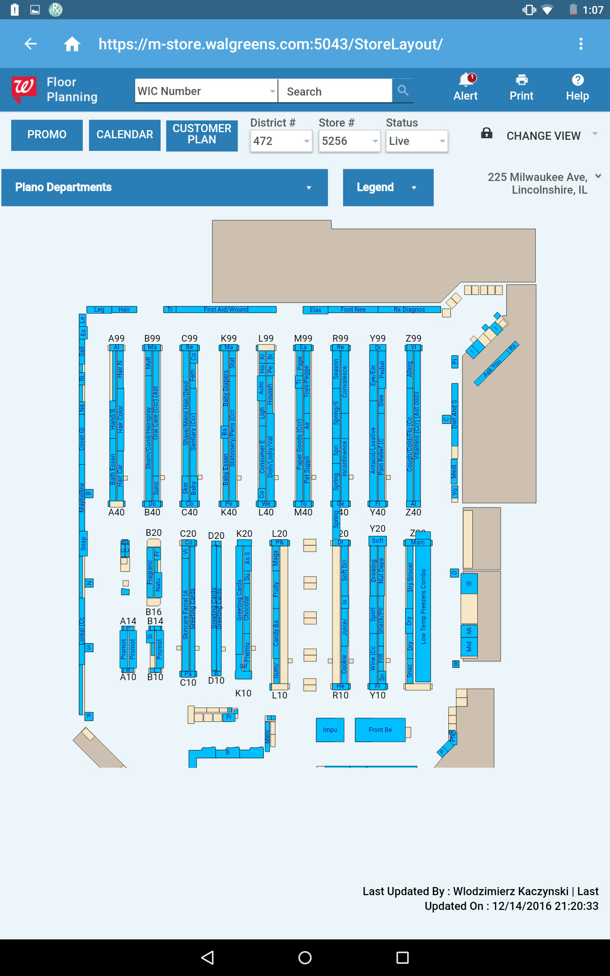
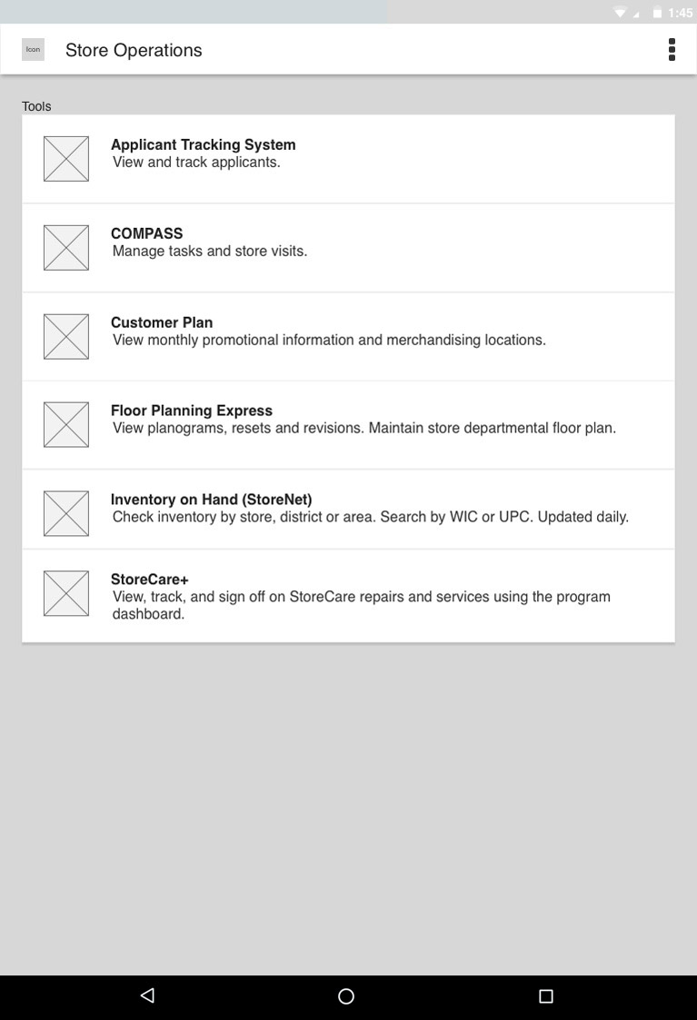
After extensive meetings between Walgreens business and executive stakeholders, the final idea that came to fruition was creating a specific app to port over Walgreens legacy applications, including their store communication system (COMPASS), floor planning systems, applicant tracking utilities, item lookup, and more. With a 5-year roadmap laid out, we worked to prioritize features, create a sitemap, and design an initial concept to lead the project forward.
Research
Research-Based Design and Iteration
Throughout the entire process, we constantly sought feedback from store employees. Our dedicated research team, which I frequently accompanied on in-store visits, interviewed store managers and employees on a variety of issues, including potential concerns around mobility, daily work habits, login time, and personal device use.
We also visited stores with clickable prototypes created in Axure, fitted to a test device to provide the most accurate representation of the application without bringing the in-progress build to stores. This guerrilla user testing strategy drove sprint-based iterations.
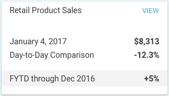
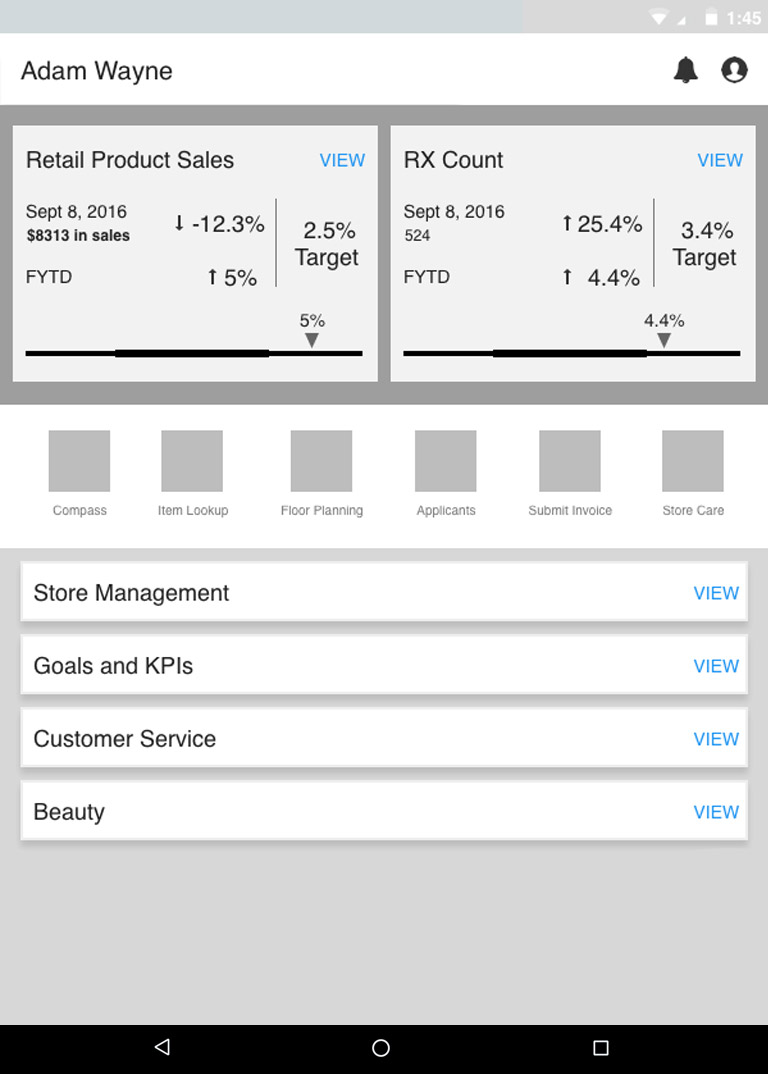
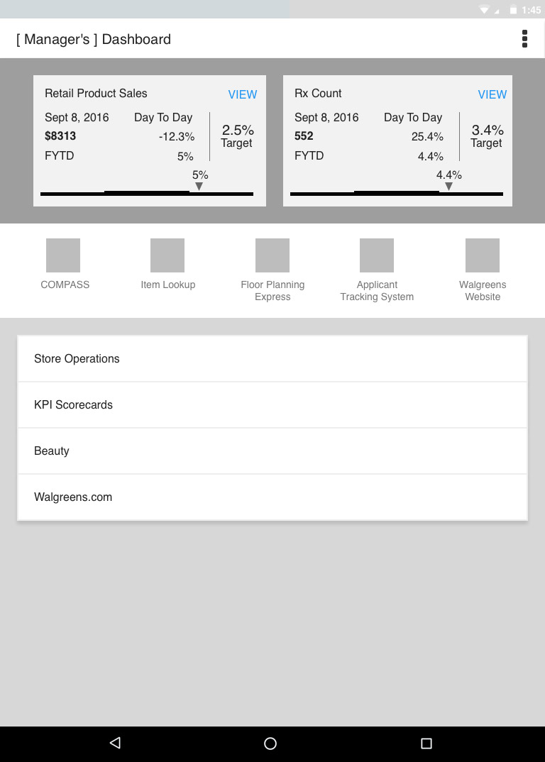
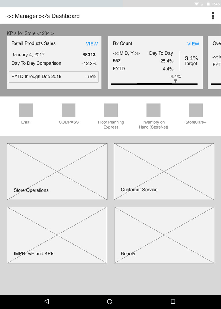
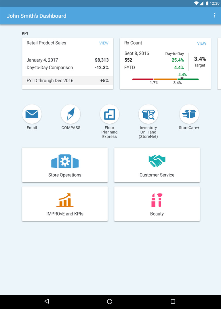
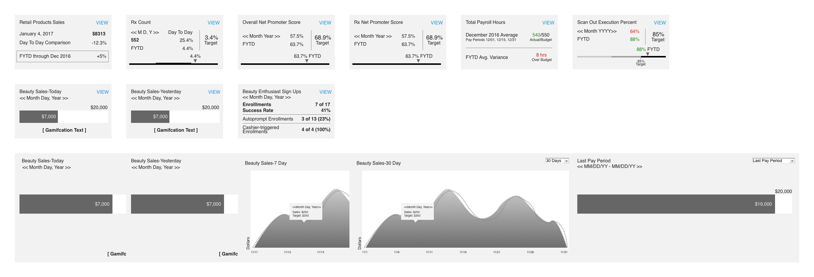
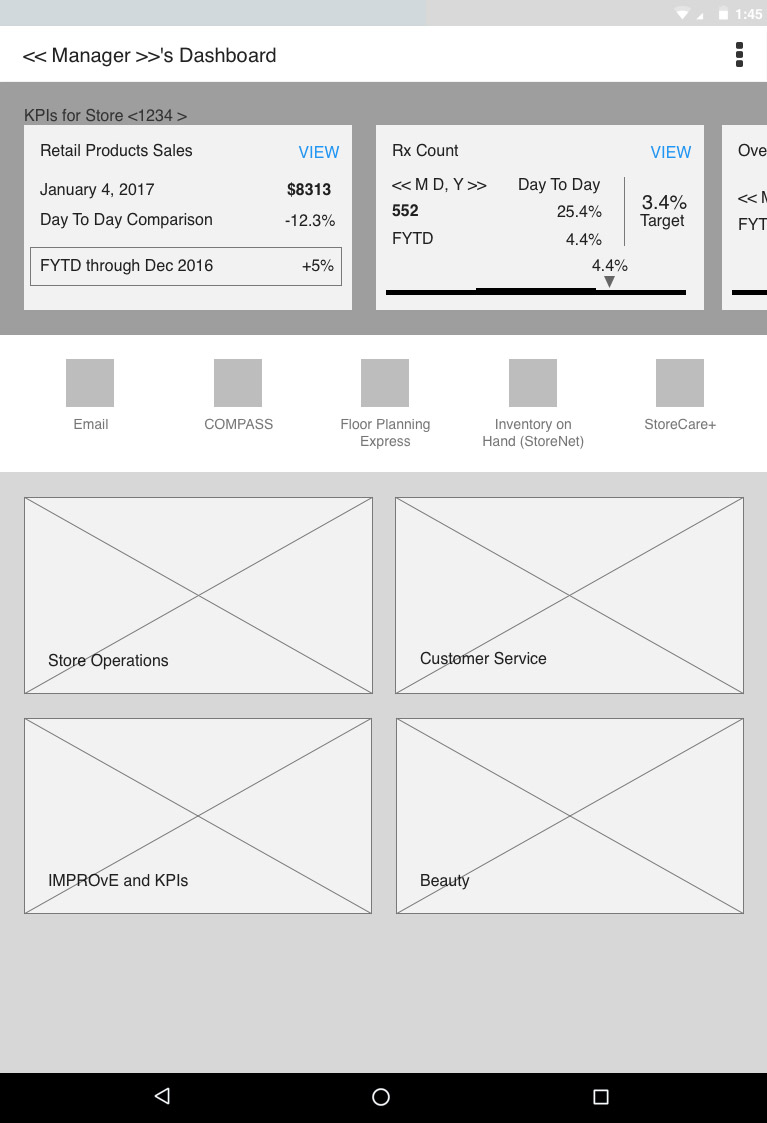
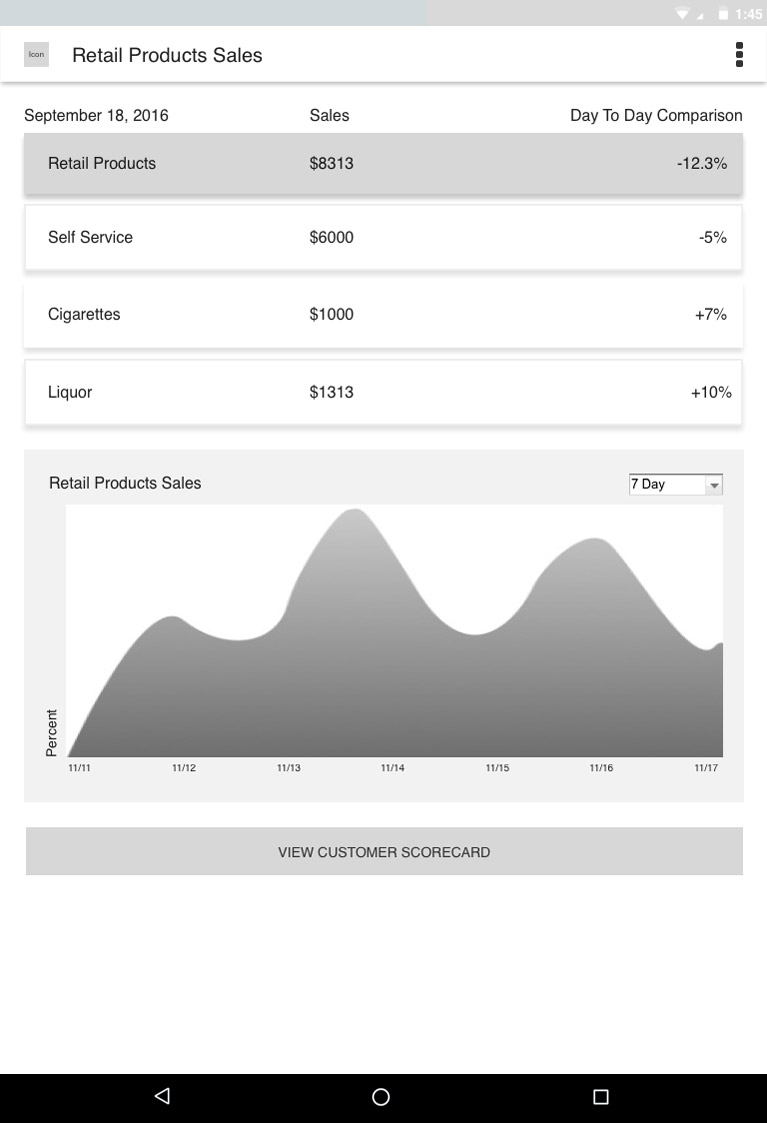
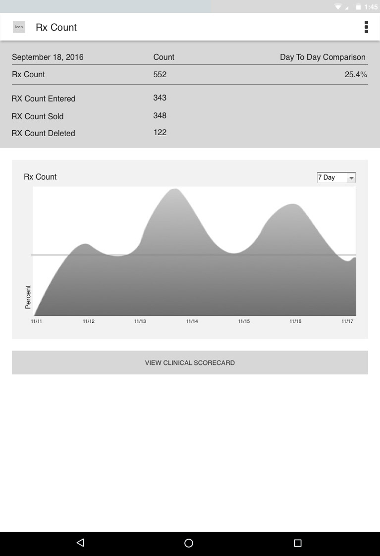
Dashboard Design
Turning an Idea into a Real App
When I joined the project, there was a rough concept of what we would call a dashboard, essentially a list of features, helpful links, and KPIs. We knew that by launch, these would be significantly expanded. Because we were working in agile, we made updates sprint by sprint based on our plan and continuous feedback.
Early in the project, we showed the initial concept to the Walgreens Advisory Board, which included the highest-level store managers, assistant managers, and pharmacists. This meeting led to the desire for a more visual approach to the dashboard and subpages. With this in mind, we iterated on the design to use imagery and color coding for category navigation, and created a set of icons to represent the different legacy applications and tools throughout the app.
Through further iteration, both the design and business teams decided imagery was not the best idea due to visual weight and hierarchy issues. We created additional concepts using more iconography with a variety of colors. In the end, we reduced the size of navigation buckets while using clear icons and a prominent-but-not-overbearing color palette to separate categories.
Role-Based Profiles
One App. Many Roles.
Transcoding
Making Legacy Systems Mobile-Ready
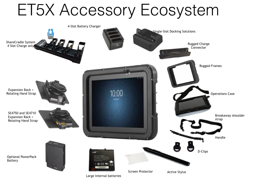
The Device
My Store: The Designated App
Throughout this process, the vision of Horizon started to come together. Horizon was no longer a broad idea, but rather a designated device with a collection of applications. The device itself was largely selected based on hands-on feedback from the Advisory Board meeting. The application my team was building would come to be known as My Store.
A variety of other applications would be placed on the device to improve store operations, ranging from email clients to notepads to camera access to translation tools. We also had short and long-term plans to include other Walgreens applications, including the consumer-facing app and an in-development inventory management app, Retail Transformation.
With the device and app defined, we had to organize the features and apps on the device itself. The selected device would use a custom device home launcher called Airwatch, which would allow us to brand the device, provide the necessary security parameters, organize apps in a custom intuitive way, and include additional troubleshooting and maintenance information.
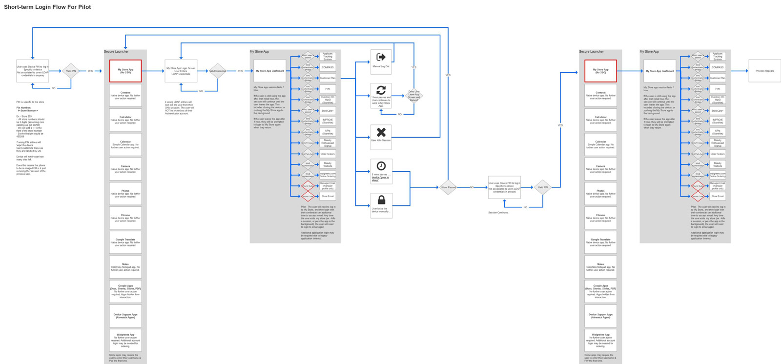
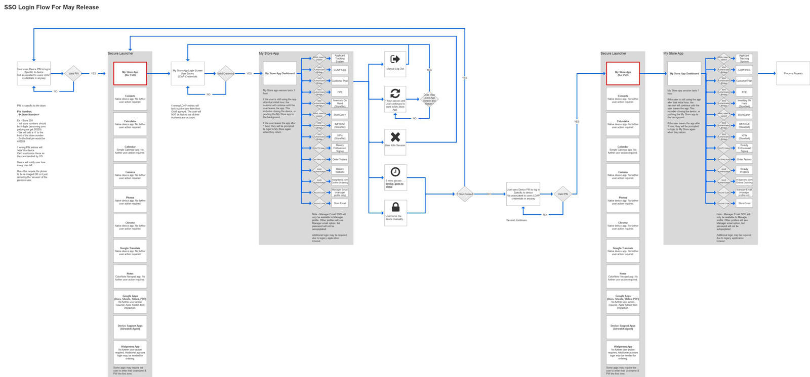
Single Sign-On
Solving the Two-Minute Login Problem
As we worked on the app and device, our teams created profiles for different user roles, from hourly customer service employees to beauty specialists to district managers to corporate leadership. Each role had slightly different use cases, so we adjusted various elements of My Store accordingly. While we planned for over 15 different roles, we focused on only 4 main roles for initial release.
With roles planned out, UX and IT had to partner on streamlining sign-on. The initial concept had users log in at device entry, loading a unique device home and My Store profile per role. The problem: Airwatch's process resulted in a huge delay of over 2 minutes in lab testing, likely longer in stores due to dated internet infrastructure.
With pilot weeks away, we gutted the Airwatch login process and built our own. This new approach removed user-based login to the device in favor of a role-agnostic device home, with SSO taking place when logging into the My Store app. Users could access role-based content with single sign-on, and much faster. For manager email (which needed to remain secure from lower-level employees), we initially made it a web link requiring separate login, then moved it fully into My Store for the initial rollout.
Wireframes
From Concepts to Deliverables
Outstanding Concerns
Challenges We Knew Were Coming
Even with all the testing and iteration, we were still left facing a few challenges and uncertainties once the device was released into the wild:
- Poor Wi-Fi infrastructure in all stores
- The potential for transcoded pages to break
- Appropriate role-based authorization
- Device abuse (using the device for non-work matters)
- Bring Your Own Device policy (issues from misuse, theft, loss, or device wear and tear)
- Theft
- Lack of important features (currently available on the PC)
- Login process edge cases
With the initial product launching in summer 2017, we planned to continue building out the application and rolling out additional devices, introducing new systems and refining old ones through additional testing, research, analytics data, and sprint iteration.